您现在的位置是:网站首页> 编程资料编程资料
纯CSS3实现的井字棋游戏css3中transform属性实现的4种功能详解CSS3.0(Cascading Style Sheet) 层叠级联样式表纯CSS3实现div按照顺序出入效果CSS3实现列表无限滚动/轮播效果css3 利用transform-origin 实现圆点分布在大圆上布局及旋转特效CSS3实现的侧滑菜单CSS3实现的3D隧道效果用CSS3画一个爱心css3 实现文字闪烁效果的三种方式示例代码六种css3实现的边框过渡效果
 2021-09-03
939人已围观
2021-09-03
939人已围观
简介 这篇文章主要介绍了纯CSS3实现的井字棋游戏,帮助大家更好的理解和使用CSS,感兴趣的朋友可以了解下
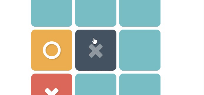
运行效果:
html
Note: use the Full Page view for the best experience.
css3
@charset "UTF-8"; /* Variables -------------------------------------------------------------- */ /* Body and Notice styling -------------------------------------------------------------- */ body { color: #b6b5ca; font-family: 'Arial', sans-serif; margin: 0; text-align: center; } h5 { font-weight: 400; padding: 0 20px; } /* Tic-tac-toe game -------------------------------------------------------------- */ .tic-tac-toe { font-family: 'Open Sans', sans-serif; height: 300px; overflow: hidden; margin: 50px auto 30px auto; position: relative; width: 300px; } @media (min-width: 450px) { .tic-tac-toe { height: 450px; width: 450px; } } .tic-tac-toe input[type="radio"] { display: none; } .tic-tac-toe input[type="radio"]:checked + label { cursor: default; z-index: 10 !important; } .tic-tac-toe input[type="radio"].player-1 + label:after { content: ""; } .tic-tac-toe input[type="radio"].player-2 + label:after { content: ""; } .tic-tac-toe input[type="radio"].player-1:checked + label:after, .tic-tac-toe input[type="radio"].player-2:checked + label:after { opacity: 1; } .tic-tac-toe input[type="radio"].player-1:checked + label { background-color: #dc685a; } .tic-tac-toe input[type="radio"].player-2:checked + label { background-color: #ecaf4f; } .tic-tac-toe input[type="radio"].turn-1 + label { z-index: 1; } .tic-tac-toe input[type="radio"].turn-2 + label { z-index: 2; } .tic-tac-toe input[type="radio"].turn-3 + label { z-index: 3; } .tic-tac-toe input[type="radio"].turn-4 + label { z-index: 4; } .tic-tac-toe input[type="radio"].turn-5 + label { z-index: 5; } .tic-tac-toe input[type="radio"].turn-6 + label { z-index: 6; } .tic-tac-toe input[type="radio"].turn-7 + label { z-index: 7; } .tic-tac-toe input[type="radio"].turn-8 + label { z-index: 8; } .tic-tac-toe input[type="radio"].turn-9 + label { z-index: 9; } .tic-tac-toe input[type="radio"].turn-1 + label { display: block; } .tic-tac-toe input[type="radio"].turn-1:checked ~ .turn-2 + label { display: block; } .tic-tac-toe input[type="radio"].turn-2:checked ~ .turn-3 + label { display: block; } .tic-tac-toe input[type="radio"].turn-3:checked ~ .turn-4 + label { display: block; } .tic-tac-toe input[type="radio"].turn-4:checked ~ .turn-5 + label { display: block; } .tic-tac-toe input[type="radio"].turn-5:checked ~ .turn-6 + label { display: block; } .tic-tac-toe input[type="radio"].turn-6:checked ~ .turn-7 + label { display: block; } .tic-tac-toe input[type="radio"].turn-7:checked ~ .turn-8 + label { display: block; } .tic-tac-toe input[type="radio"].turn-8:checked ~ .turn-9 + label { display: block; } .tic-tac-toe input[type="radio"].left + label { left: 0; } .tic-tac-toe input[type="radio"].top + label { top: 0; } .tic-tac-toe input[type="radio"].middle + label { left: 100px; } .tic-tac-toe input[type="radio"].right + label { left: 200px; } .tic-tac-toe input[type="radio"].center + label { top: 100px; } .tic-tac-toe input[type="radio"].bottom + label { top: 200px; } @media (min-width: 450px) { .tic-tac-toe input[type="radio"].middle + label { left: 150px; } .tic-tac-toe input[
相关内容
- HTML+CSS3+JS 实现的下拉菜单CSS3贝塞尔曲线示例:创建链接悬停动画效果css3悬停按钮-CSS3鼠标悬停按钮阴影缩放特效代码CSS3 实现时间轴动画CSS3实现菜单悬停效果详解CSS3:overflow属性详解css3中的伪类before和after常见用法CSS3+HTML5+JS 实现一个块的收缩与展开动画效果10种CSS3实现的loading动画,挑一个走吧?CSS3实现带剪切动画的幻灯片特效代码详解CSS3媒体查询响应式布局bootstrap 框架原理实战(推荐)
- CSS3 实现倒计时效果css3中transform属性实现的4种功能详解CSS3.0(Cascading Style Sheet) 层叠级联样式表纯CSS3实现div按照顺序出入效果CSS3实现列表无限滚动/轮播效果css3 利用transform-origin 实现圆点分布在大圆上布局及旋转特效CSS3实现的侧滑菜单CSS3实现的3D隧道效果用CSS3画一个爱心css3 实现文字闪烁效果的三种方式示例代码六种css3实现的边框过渡效果
- css样式常见图形效果展示的实例代码使用CSS的clip-path属性实现不规则图形的显示使用css实现特殊标志或图形css如何绘制特殊图形的方法示例详解常用css样式(布局)详解CSS3中常用的样式【基本文本和字体样式】编程式处理Css样式的示例代码使用CSS伪元素控制连续几个元素的样式方法纯CSS3 gradient属性制作36种漂亮的html网页渐变按钮样式
- 使用纯 CSS 实现滚动阴影效果纯css3实现横向无限滚动的示例代码CSS3制作圆形滚动进度条动画的示例css实现隐藏滚动条并可以滚动内容的实例代码CSS3实现3D小球滚动撞击遮挡板特效源码Css3实现无缝滚动防抖css文字阴影渐渐模糊效果的实现css3悬停按钮-CSS3鼠标悬停按钮阴影缩放特效代码
- 探索CSS属性*-gradient的实用价值CSS Transition通过改变Height实现展开收起元素从QQtabBar看css命名规范BEM的详细介绍css实现两栏布局,左侧固定宽,右侧自适应的多种方法CSS 实现Chrome标签栏的技巧CSS实现两列布局的N种方法CSS实现隐藏搜索框功能(动画正反向序列)CSS3中Animation实现简单的手指点击动画的示例详解CSS中的特指度和层叠问题详解overflow:hidden的作用(溢出隐藏、清除浮动、解决外边距塌陷)关于CSS浮动与取消浮动的问题
- 使用CSS3制作版头动画效果CSS实现漂亮的时钟动画效果的实例代码css3动画鼠标放上图片逐渐变大鼠标离开图片逐渐缩小效果CSS 奇思妙想边框动画效果的实现CSS 动态高度过渡动画效果的实现CSS3分享图标按钮动画特效代码CSS3通过var()和calc()函数实现动画特效
- CSS3实现红包抖动效果css3 transform过渡抖动问题解决css3动画效果抖动解决方法CSS 控制Html页面高度导致抖动问题的原因CSS3新浪微博模板商店鼠标悬停图片抖动特效css3让div随鼠标移动而抖动起来CSS 控制因Html页面高度导致抖动的问题解决方法
- css 利用 position + margin 实现固定盒子横向纵向居中的方法CSS 同级元素position:fixed和margin-top共同使用的问题使用CSS实现盒子水平垂直居中的方法(8种)CSS盒子居中的常用的几种方法(小结)
- html5+css3之制作header实例与更新html5+css3之CSS中的布局与Header的实现css为什么要放在head标签中
- CSS3中animation实现流光按钮效果CSS3动画之利用requestAnimationFrame触发重新播放功能
点击排行
本栏推荐


